ggspark
'ggplot2' Functions to Create Tufte Style Sparklines
Functions to help with creating sparklines in the style of Edward Tufte < https://www.edwardtufte.com/bboard/q-and-a-fetch-msg?msg_id=0001OR&topic_id=1> in 'ggplot2'. It computes ribbon geoms with the interquartile ranges and points and/or labels at the beginning, end, max, and min points.
ggspark
The goal of ggspark is to help create ggplot2 functions that help with creating sparkline plots in the style of Edward Tufte, such as this one
 Original sparklines, source Edward
Tufte.
Original sparklines, source Edward
Tufte.
Thus, the package has two main functions: stat_interquartilerange()
that draws a geom_ribbon() between the 1st and 3rd quartile of the
variable in the y axis, and stat_sparklabels() that draws points or
text labels in the beginning, min, max, and end points of the variable
in the y axis.
Installation
You can install the development version of ggspark like so:
devtools::install_github("marcboschmatas/ggspark")
Example
The stat_sparklabels() function needs a colour scale with three
values. The first one will be using for the start and end points of the
line, the second one for the max, and the third one for the min.
library(ggplot2)
library(ggspark)
ggplot(airquality, aes(Day, Wind, group = Month)) +
  stat_interquartilerange(geom = "ribbon",
                          show.legend = FALSE) +
  geom_line() +
  stat_sparklabels(geom = "label",
                   show.legend = FALSE) +
  scale_colour_manual("", values = c("black", "blue", "red")) +
  scale_y_continuous(limits = c(0, 25)) +
  facet_grid(Month~.) +
  ggtitle("Daily wind intensity by month in NYC") +
  theme_minimal() +
  theme(panel.grid = element_blank(),
        axis.ticks = element_line())
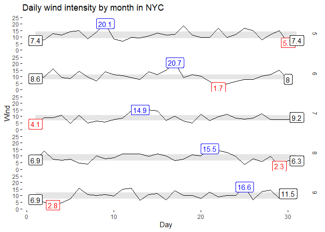 It has an
optional
It has an
optional label_fun parameter that allows to modify the label
aesthetics (such as rounding, adding percentage or currency suffixes and
prefixes…).
library(ggplot2)
library(ggspark)
ggplot(airquality, aes(Day, Wind, group = Month)) +
  stat_interquartilerange(geom = "ribbon",
                          show.legend = FALSE) +
  geom_line() +
  stat_sparklabels(geom = "label", label_fun = \(x) round(x, 0),
                   show.legend = FALSE) +
  scale_colour_manual("", values = c("black", "blue", "red")) +
  scale_y_continuous(limits = c(0, 25)) +
  facet_grid(Month~.) +
  ggtitle("Daily wind intensity by month in NYC") +
  theme_minimal() +
  theme(panel.grid = element_blank(),
        axis.ticks = element_line())
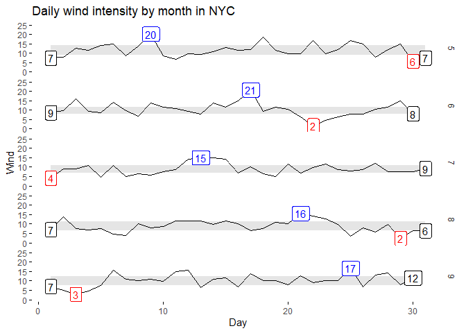
It is also possible to use points instead of labels.
library(ggrepel)
#> Warning: package 'ggrepel' was built under R version 4.3.3
ggplot(airquality, aes(Day, Wind, group = Month)) +
  stat_interquartilerange(geom = "ribbon",
                          show.legend = FALSE) +
  geom_line() +
  stat_sparklabels(geom = "point",
                   show.legend = FALSE) +
  scale_colour_manual("", values = c("black", "blue", "red")) +
  scale_y_continuous(limits = c(0, 25)) +
  facet_grid(Month~.) +
  ggtitle("Daily wind intensity by month in NYC") +
  theme_minimal() +
  theme(panel.grid = element_blank(),
        axis.ticks = element_line())
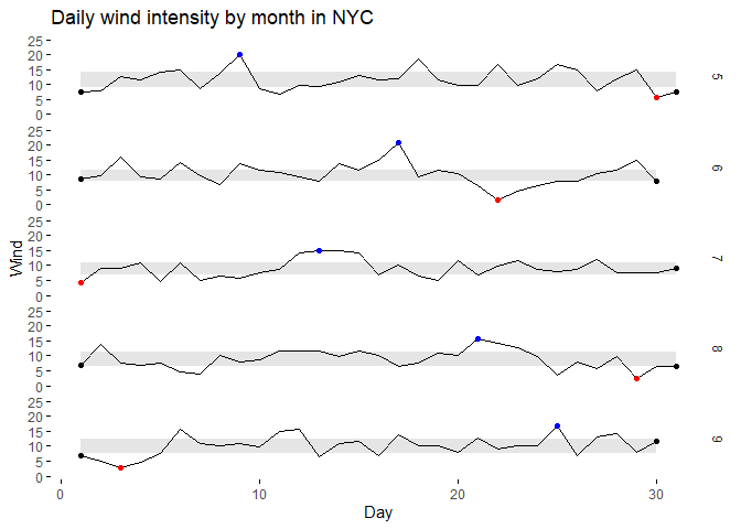
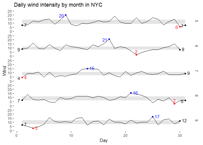
With ggrepel, it is possible to combine both text and dots.
library(ggrepel)
ggplot(airquality, aes(Day, Wind, group = Month)) +
  stat_interquartilerange(geom = "ribbon",
                          show.legend = FALSE) +
  geom_line() +
  stat_sparklabels(geom = "point", label_fun = \(x) round(x, 0),
                   show.legend = FALSE) +
    stat_sparklabels(geom = "text_repel", label_fun = \(x) round(x, 0),
                   show.legend = FALSE) +
  scale_colour_manual("", values = c("black", "blue", "red")) +
  scale_y_continuous(limits = c(0, 25)) +
  facet_grid(Month~.) +
  ggtitle("Daily wind intensity by month in NYC") +
  theme_minimal() +
  theme(panel.grid = element_blank(),
        axis.ticks = element_line())