shapviz
SHAP Visualizations
Visualizations for SHAP (SHapley Additive exPlanations), such as waterfall plots, force plots, various types of importance plots, dependence plots, and interaction plots. These plots act on a 'shapviz' object created from a matrix of SHAP values and a corresponding feature dataset. Wrappers for the R packages 'xgboost', 'lightgbm', 'fastshap', 'shapr', 'h2o', 'treeshap', 'DALEX', and 'kernelshap' are added for convenience. By separating visualization and computation, it is possible to display factor variables in graphs, even if the SHAP values are calculated by a model that requires numerical features. The plots are inspired by those provided by the 'shap' package in Python, but there is no dependency on it.
{shapviz} 


Overview
{shapviz} provides typical SHAP plots:
sv_importance(): Importance plot (bar/beeswarm).sv_dependence()andsv_dependence2D(): Dependence plots to study feature effects and interactions.sv_interaction(): Interaction plot (beeswarm/bar).sv_waterfall(): Waterfall plot to study single or average predictions.sv_force(): Force plot as alternative to waterfall plot.
SHAP and feature values are stored in a "shapviz" object that is built from:
- Models that know how to calculate SHAP values: XGBoost, LightGBM, and H2O.
- SHAP crunchers like {fastshap}, {kernelshap}, {treeshap}, {fastr}, and {DALEX}.
- SHAP matrix and corresponding feature values.
We use {patchwork} to glue together multiple plots with (potentially) inconsistent x and/or color scale.
Installation
# From CRAN
install.packages("shapviz")

# Or the newest version from GitHub:
# install.packages("devtools")
devtools::install_github("ModelOriented/shapviz")
Usage
Shiny diamonds... let's use XGBoost to model their prices by the four "C" variables:
library(shapviz)
library(ggplot2)
library(xgboost)

set.seed(1)

xvars <- c("log_carat", "cut", "color", "clarity")
X <- diamonds |>
  transform(log_carat = log(carat)) |>
  subset(select = xvars)

# Fit (untuned) model
fit <- xgb.train(
  params = list(learning_rate = 0.1),
  data = xgb.DMatrix(data.matrix(X), label = log(diamonds$price)),
  nrounds = 65
)

# SHAP analysis: X can even contain factors
X_explain <- X[sample(nrow(X), 2000), ]
shp <- shapviz(fit, X_pred = data.matrix(X_explain), X = X_explain)

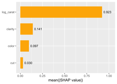
sv_importance(shp, show_numbers = TRUE)
sv_importance(shp, kind = "bee")
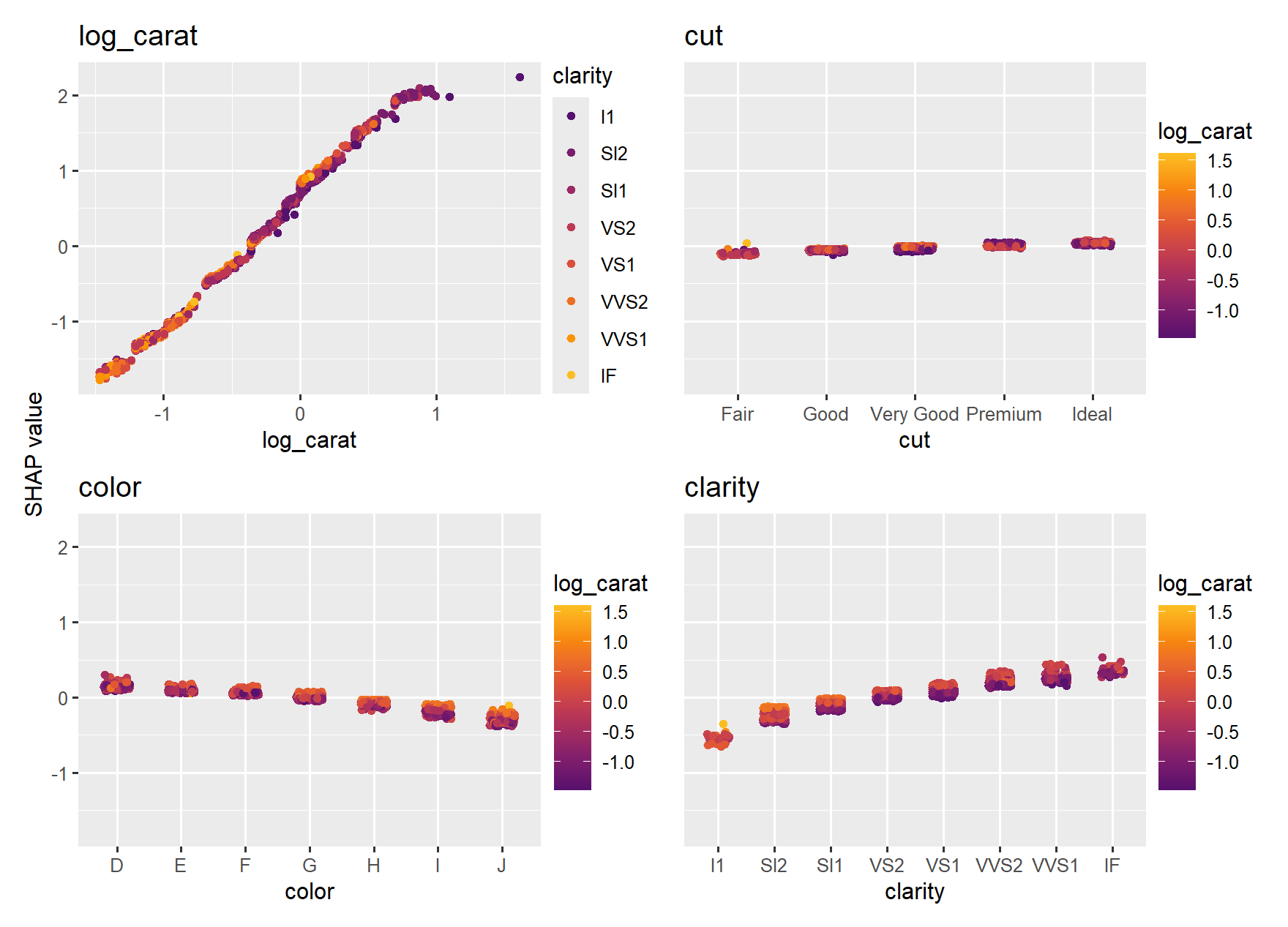
sv_dependence(shp, v = xvars, share_y = TRUE)

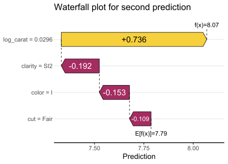
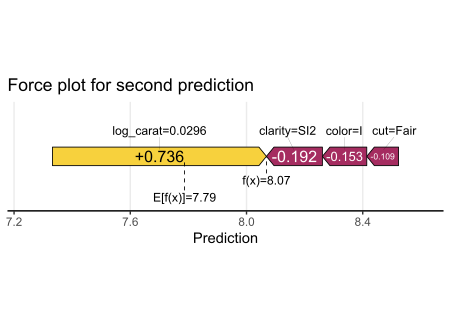
Decompositions of individual predictions can be visualized as waterfall or force plot:
sv_waterfall(shp, row_id = 2) +
  ggtitle("Waterfall plot for second prediction")

sv_force(shp, row_id = 2) +
  ggtitle("Force plot for second prediction")
More to Discover
Check-out the vignettes for topics like:
- Basic use (includes working with other packages and SHAP interactions).
- Multiple models, multi-output models, and subgroup analyses.
- Plotting geographic effects.
- Working with Tidymodels.
References
[1] Scott M. Lundberg and Su-In Lee. A Unified Approach to Interpreting Model Predictions. Advances in Neural Information Processing Systems 30 (2017).